Iago Novais is a product designer for fintech, based in São Paulo.
Designed Open Finance and Pix journeys at Mercado Pago,
recognized 4× at the Open Summit Awards 2022.

Pix Area on Desktop

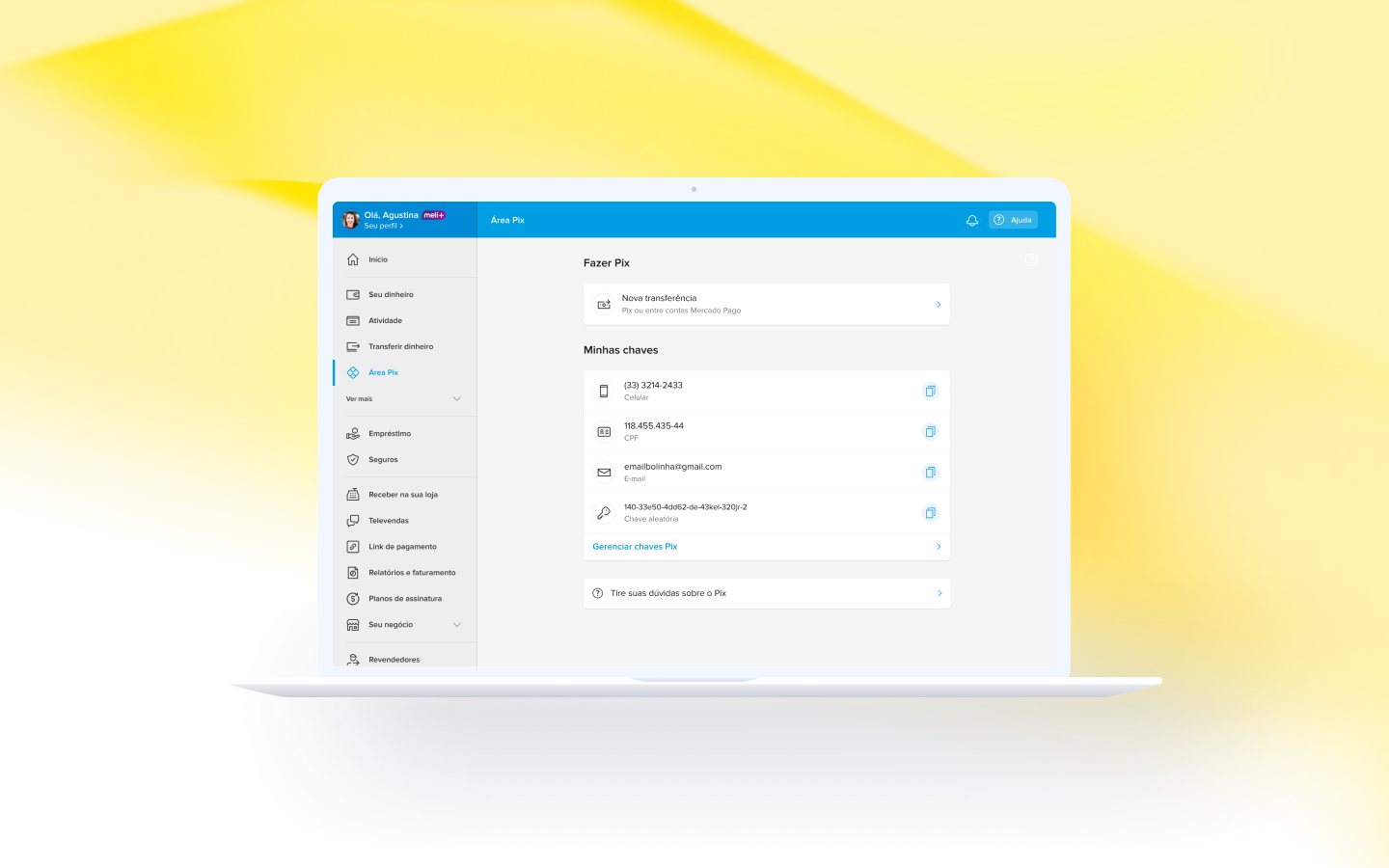
Bringing transfers, Pix keys and refund tracking to Mercado Pago’s desktop web, for people who manage their account from a computer.

Role

Product Designer

Team

Design lead, UX writer, PM, engineering

Platform

Web (desktop and mobile web) · Individuals and sellers

Timeline

Shipped Q4 2023

The Pix area on Mercado Pago’s desktop web, with transfers and registered keys
4

Page states the Pix area adapts to

5

Refund-request scenarios mapped across 2 moments

2

Audiences, each with its own first-time experience

4

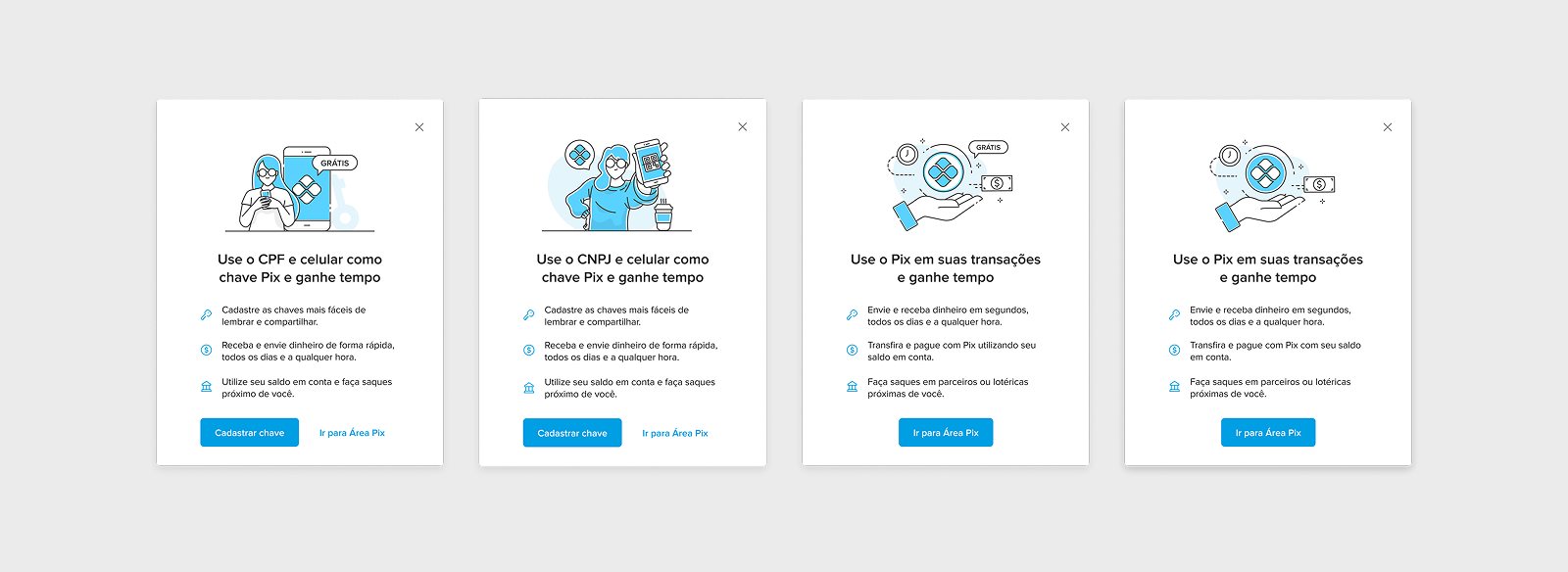
Original illustrations I created for the first-time experience

Summary

Pix was first built for the phone. On desktop, Mercado Pago users could do only part of what the app offered, and sellers, who run their business from a computer, felt it most. I designed the Pix area for the web: registering and managing Pix keys, starting transfers, and following refund requests, in a page that adapts to each user’s situation.

I was the product designer, working with a UX writer and our design lead, alongside product and engineering. I also illustrated the first-time experience.

Context & challenge

Team research with Pix users showed that many newcomers confused basic concepts, didn’t understand key portability and couldn’t remember which keys they had registered. Desktop users also told us the experience felt inconsistent with the app and that they couldn’t do everything in one place.

Simply adapting screens wouldn’t work: the same page had to make sense for someone with no Pix key, someone moving a key from another bank (portability) and someone waiting on a refund request, for both individuals and sellers. On top of that, most components had been built for mobile, so we had to rethink how they would behave on the web.

Process

01

Reference, not copy

Used the mobile experience as a reference and decided what to keep, adapt or drop, preserving as much of the original experience as possible within the technical limits of the web.

02

Map the paths

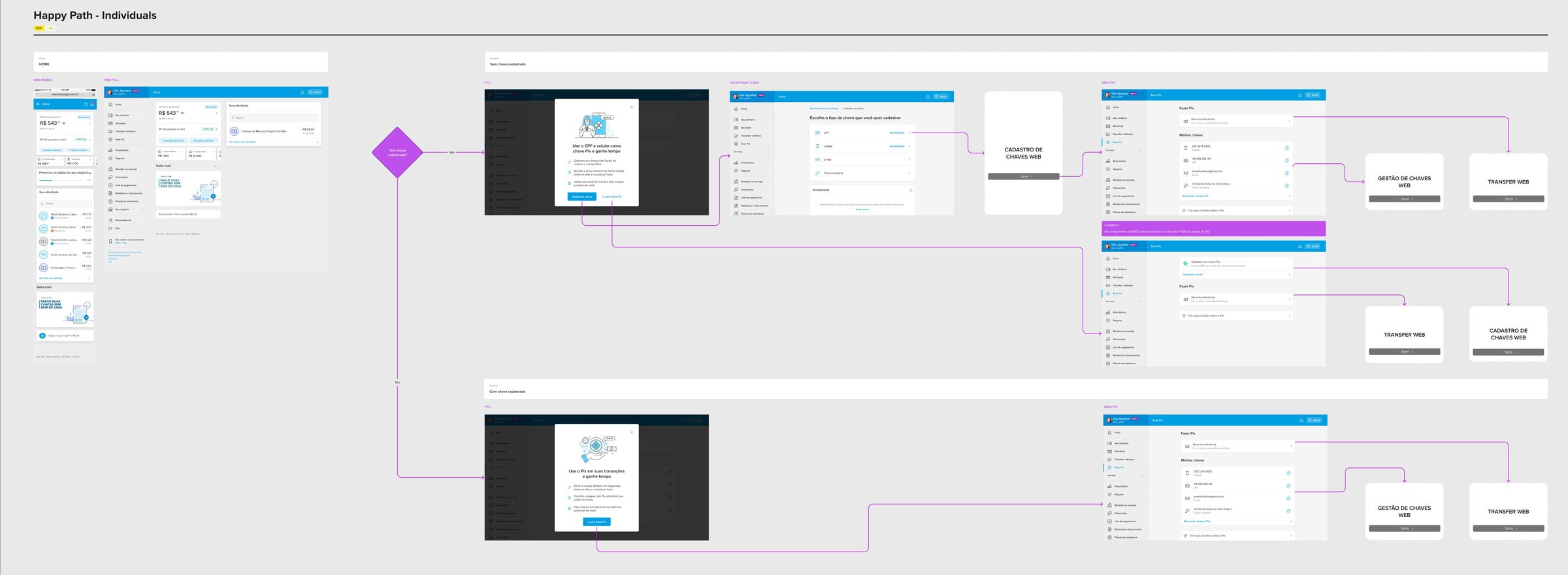
Mapped happy paths for individuals and sellers, plus error states, before drawing screens.

03

Document every state

Documented every key use case (no key, with key, portability in and out, multiple portabilities) and the MedPix display rules.

04

Review before handoff

Feedback rounds with the team, design system specialists, product and engineering.

Happy path for individuals, from the home to key registration and transfers on web

Key decisions

01 — What needs resolving comes first

The page reorders itself based on the user’s state: no keys registered, with or without a portability request, registered keys, or keys with portability in progress. Refund requests under MED, the Central Bank’s refund mechanism for Pix fraud, take priority over key registration.
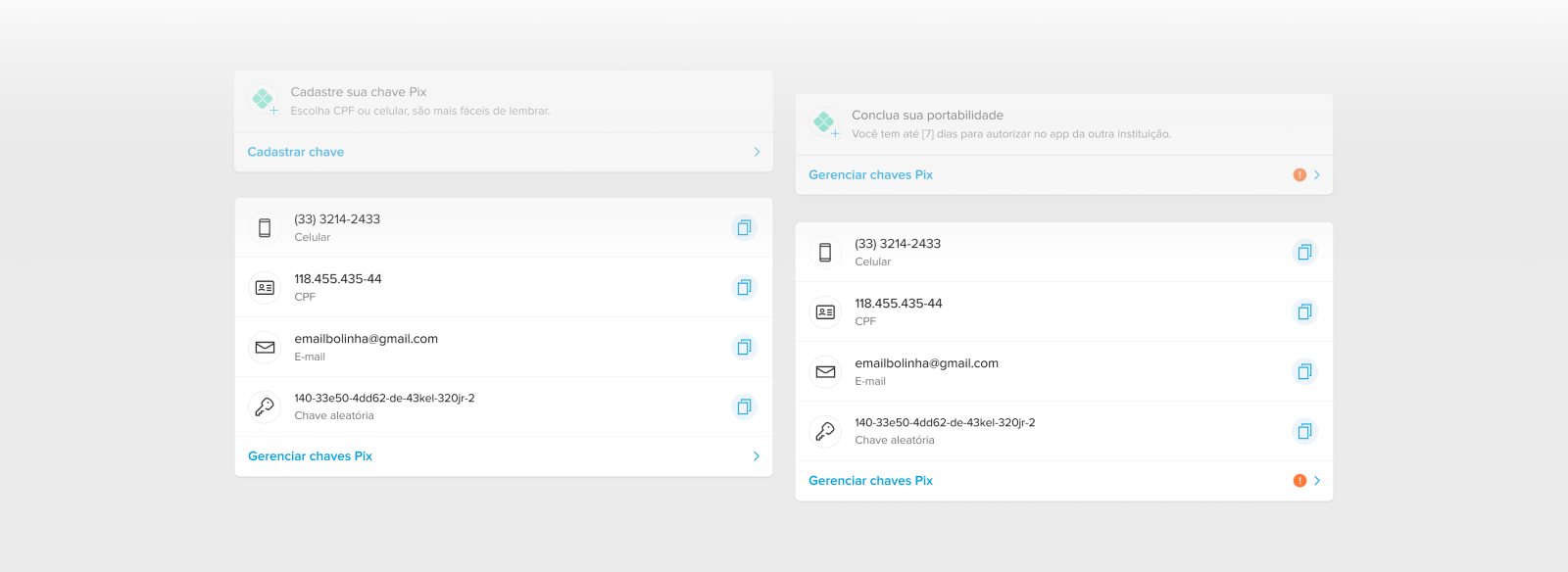
Key cards in different states: no key, portability pending, registered keys

02 — Two audiences, two funnels

Individuals and sellers share the same flow, but they come for different reasons. Individuals are invited to use their CPF and phone as keys to pay faster; sellers, their CNPJ and phone to start receiving. With the UX writer, I designed a first-time modal for each profile, with and without registered keys, and I created the four illustrations that carry each message.

Four first-time modals for individuals and sellers, with and without keys

03 — One message at a time

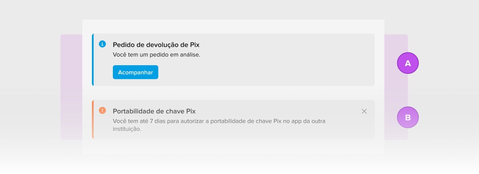
A user can have several refund requests and portabilities open at once, and stacking every alert would bury what matters. We shipped a minimum version first and defined the full display rules as the next step: one message at a time, prioritized by status, which the user can dismiss.

Refund-request and portability messages compared

Outcome

The Pix area shipped on web in Q4 2023, and the team later expanded it with Pix Copia e Cola. I no longer have access to post-launch data.

What I’d do differently

Keep the post-launch data. I lost access to it, so I can’t show you the real impact this flow had. Lesson learned.

Designing for states, not screens: the same page had to feel right for someone just starting with Pix and for someone dealing with fraud.

Thanks to Thiago, Thaci and Andreza.